In this post I will explain how to customize toolbars and button icons are handled by the Customize dialog box.
The best way to customize commands in BricsCAD is through toolbars -- in my opinion. Toolbars give me single-click access to almost any command or group of commands and let us collect our most-used commands into one or more convenient strips.
The following topics are covered in this post:
- Customizing the look of toolbars and buttons
- Creating new toolbars and flyouts
- Understanding controls and separators
BricsCAD lets you customize these aspects of toolbars:
- Name, default position, size and default visibility of toolbars
- Flyouts and separator bars
- Titles, macros, help strings and button images
Customizing the Look of Toolbars
There are two ways to customize toolbars in BricsCAD:
- Change the look of toolbars
- Change the macros executed by toolbar buttons
The first one is simpler, as it involves cosmetic changes, such as rearranging buttons, making new icons or defining new toolbars. The second way involves programming by (re)writing macros that activate one or more commands when the toolbar button is clicked.
First, here is how to change the looks of toolbars.
REARRANGING TOOLBARS
The first time you start a fresh copy of BricsCAD in the toolbar workspace, you'll see that it has several toolbars docked along the edges of the drawing area. "Docked" means that when you move the main BricsCAD window, docked toolbars move along with it.
![]()
Docked and floating toolbars
Toolbars don't have to be docked; they can float. When toolbars float, they are independent of the BricsCAD window. When you move or resize the BricsCAD window, the floating toolbars remain where they are.
QUICK SUMMARY OF TOOLBAR COMMANDS & VARIABLES
The following command works with toolbars:
Toolbar and -Toolbar --- displays and hides toolbars by name, at the command line
The following variables work with toolbars:
ToolbarIconSize --- changes the size of icons between regular, large and extra large
MenuName --- reports the path and name of the current menu file
Tutorial: Dragging and Moving Toolbars
Look closely at the left end of a toolbar that is docked. There you see a line of dots, shown in the figure above. This is called the "drag handle." By dragging the handle, you move the toolbar to another location in the BricsCAD window or make it float.
You move floating toolbars by dragging them by their title bars. Floating toolbars can be relocated to other edges of the drawing area --- or left floating on the screen.
Here is how to move toolbars:
Position the cursor over the drag handle (line of dots).
Hold down the left mouse button and then move the mouse.
Drag the toolbar away from the edge of the drawing area. Notice the thin, gray, rectangular outline. This is called the dock indicator, as shown by the figure below.

Moving a docked toolbar
If you were to release the mouse button at this point, the toolbar would jump back to its docked position.
TIP You prevent the toolbar from docking inadvertently by holding down the Ctrl key.To prevent any toolbar or panel (palette) from moving, use the LockUI variable. Its options are listed in the Settings dialog box, as follows:

Drag the toolbar a bit further and notice that the rectangular outline becomes thicker. This is called the float indicator.

Symbology for a floating toolbar
Let go of the mouse button now and the toolbar floats. With the toolbar floating, you move it around by dragging its title bar.
To dock the toolbar again, drag it by its title bar back against one edge of the drawing area and then let go of the mouse button.
QUICK SUMMARY OF TOOLBAR PARAMETERS
The look and position of every toolbar is defined by an individual set of parameters defined by the Customize dialog box. Here is an overview of the meaning of the parameters.
![]()
toolbar parameter BricsCAD
Title --- identifies the toolbar to the BricsCAD system and appears on the title bar of the toolbar (you can make the title any descriptive phrase that you like)
ID --- BricsCAD assigned identification of the UI element; read-only (cannot be edited)
Alias --- code name assigned by BricsCAD to identify this toolbar (although you can edit this value, I suggest that this would be an unwise move)
Default Display (formerly Visible) --- determines whether the toolbar is displayed or hidden when BricsCAD starts up; choose from Add to Workspaces and Don't Add to Workspaces
Rows --- number of rows of a floating toolbar
Xval and Yval --- x and y coordinates of a floating toolbar's upper left corner, as measured from BricsCAD's upper left corner
TIP Although not a toolbar, the Command Bar can also be made to float and resize. To float, drag the left edge into the drawing area.![]()
Once floating, you can move the Command Bar window by its title bar and resize it by its edges --- just like a toolbar. To dock it again, drag the Command Bar window back into place.
To turn the Command Bar on and off, press Ctrl+9 (Cmd+9 on Mac).
Tutorial: Turning Toolbars On and Off
When you want to turn on a toolbar (or turn one off), then follow these steps:![]()
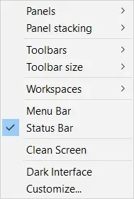
Accessing UI elements from the shortcut menuRight-click any toolbar or the ribbon. Notice that a shortcut menu appears. (new in V20) This shortcut menu was redesigned in BricsCAD V20.
Panels --- lists the names of panels
Panel Stacking --- options for how multiple panels are displayed
Toolbars --- lists the names of toolbars, illustrated at right
Toolbar size --- change the size of icons between normal, large and extra large
Workspace --- select the workspace to make current
Menu Bar --- toggles the menu bar on and off Status bar --- toggles the status bar
Clean Screen --- toggles the clean screen state
Dark interface (new in V20) --- toggles the theme between light and dark interface
Customize --- opens the Customize dialog boxClick Toolbars and then click BRICSCAD. A submenu lists the names of toolbars, as illustrated at right. The check mark means that the toolbar associated with the name is turned on (displayed):
- Turn on a toolbar select its name from the submenu. Notice that the shortcut menu disappears and the toolbar appears.
- Turn off a toolbar click a name *with *a check mark.
TIPS You can turn on (or off) all toolbars at once through the Toolbar command, as follows::toolbar Enter Toolbar name, or <ALL>: all Enter an option [Show/Hide] <Show>: sThis command can also turn on and off individual toolbars, which is useful in macros and LISP routines.When toolbars are floating, you can turn them off by clicking the red x in the upper right corner.
Making New Toolbars and Modifying Them
You create new toolbars with any set of buttons of your choosing. You can change the content of the toolbar by adding and removing buttons, controls, flyouts and separator bars --- as well as designing your own icons. Let's see what this means and how it is done.
TUTORIAL: HOW TO CREATE A NEW TOOLBAR
For this tutorial, you make a toolbar with commands related to grouping, as BricsCAD doesn't offer such a toolbar. Groups are like unnamed blocks and are easily editable. They are made with the Group command
In this tutorial you create a new toolbar named "Group" that holds the Group command.
![]()
Three panes of customizing toolbars
Open the Customize dialog box. I find the quickest way to do this is to type the Cui alias at the command prompt. Other methods include the following:
- Right-click any toolbar and then from the context menu, select Customize
- From the Tools menu, select Customize
- Enter the Customize command
When the Customize dialog box appears, choose the Toolbars tab. Notice the three panes and how they relate to toolbar customization:
- Toolbar pane --- (on the left) lists the names of all toolbars in BricsCAD, sorted by the order in which they were created. Within each toolbar name are names of commands, represented by icons.
- Command pane --- (on the right) lists the names of all commands available in BricsCAD, sorted by the order in which they appear in dropdown menus. For instance, file-related commands are listed under File.
- Parameters pane --- (at the bottom) lists parameters controlling the look and function of toolbars and their buttons. Here you edit the names, command macros, button images, help strings and optional Diesel code for each button.
To create the new toolbar, right-click the BRICSCAD node and then choose Append toolbar from the shortcut menu.
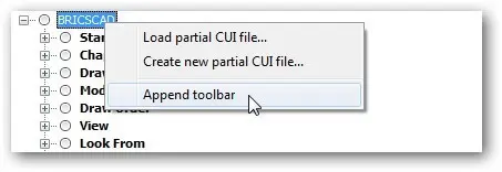
Appending a new toolbar
Notice the Add Toolbar dialog box.
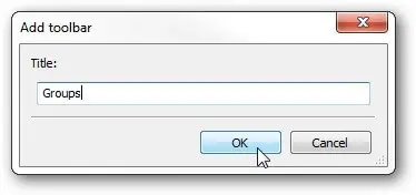
Naming the new toolbar
For this tutorial, follow these steps:
a. Enter "Groups" for the name
Title: Groups
b. Click OKThe name will appear on the title bar of floating toolbars --- as well as identify the toolbar to BricsCAD. Notice that BricsCAD adds the new (but empty) toolbar named Group to the end of the list. Also notice that it fills out the Macro pane (in the lower half of the dialog box) with some preset parameters.
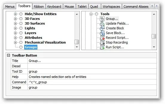
Newly created toolbar named "Groups"
With the toolbar created, you now add buttons. The easiest way (I find) is to drag and drop buttons from the Tools pane onto the new Groups node. Follow these steps:
a. Because the Groups command is listed under Tools, so scroll down to Tools.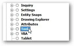
Finding a command in a collection
b. Open the Tools group by clicking the + sign.
c. Choose the Groups ... item.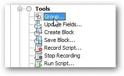
Choosing the Group tool
d. Drag "Groups..." over to the Toolbars pane and then deposit on the Groups toolbar.

Newly created toolbar named "Groups"
Notice that BricsCAD fills the Macro pane with preset parameters.
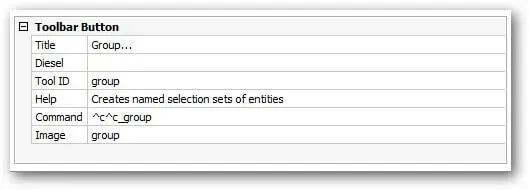
Click OK. Notice the new toolbar

New toolbar
(If you do not see the toolbar, you may need to turn it on by right-clicking another toolbar and then choosing BRICSCAD | Groups from the shortcut menu.)
Click the button to ensure it works correctly: the Group command should execute by displaying the Entity Grouping dialog box.
Tutorial: Alternative Method
There is a second method for populating toolbars. It involves a dialog box and is useful if you are not fond of dragging'n dropping.
(Follow steps 1-4 above.)
With the blank toolbar created, it's time to add a button. Follow these steps:
In the Toolbars pane, right-click the Groups item.
From the shortcut menu, choose Append Tool.
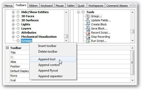
Using the Append Tool alternative
Notice the Add Tool dialog box. Ensure that the Select Available Tool option is selected.
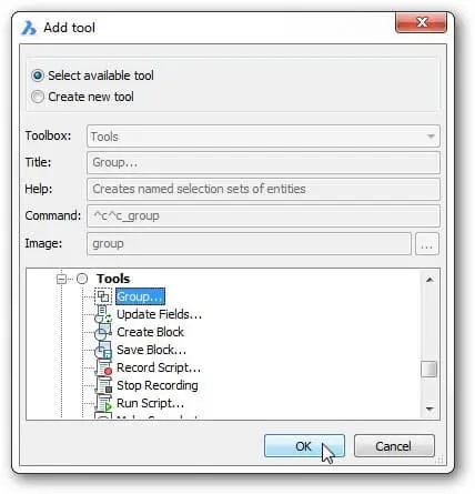
Choosing the Grouo tool
d. As before, you can find the Groups command under Tools, so scroll down to Tools and then open the Tools group by clicking the + sign.
e. Choose Groups and then click OK. Notice that BricsCAD fills the Macro pane with preset parameters.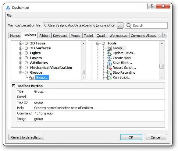
Group command added to the Groups toolbar
Adding Controls, Flyouts and Separators
Toolbars can contain more than just buttons. There are other elements available, including controls, flyouts and separators.
ABOUT CONTROLS (DROPLISTS)
Controls are better known as droplists . When the user clicks a control, BricsCAD drops a list of options, such as names of colors or linetypes. You cannot customize controls.
Four controls are illustrated below, with the Color control showing its droplist. From left to right, you see the controls for layers, colors, linetypes and line weights.
![]()
Color control lists the names of colors
BricsCAD comes with these controls that you can add to and remove from toolbars:.
- Color --- droplist of default and recently-used colors
- Layer --- droplist of layer names and settings
- Linetype --- droplist of loaded linetypes
- Lineweight --- droplist of standard line weights
- Text Style --- droplist of text style names
- Dimension Style --- droplist of dimension style names
- Plot Style --- droplist of table plot style names; available only when table-based styles are enabled
- Layer State --- droplist of named layer states
- Layer Filter --- droplist of named layer filters
- UCS --- droplist of named UCSes
- Perspective --- slider bar that toggles perspective mode and then zoom in or out
- Workspace --- droplist of available workspace names
- View --- droplist of named views
- MLeader Style --- droplist of multileader style names
- Visual Style --- droplist of visual style names
Tutorial: Adding Controls (Droplists) to Toolbars
To add a control to a toolbar, follow these steps:
In the Customize dialog box's Toolbars tab, right-click an existing toolbar name. For this tutorial, choose Groups.
In the shortcut menu, choose Append control.
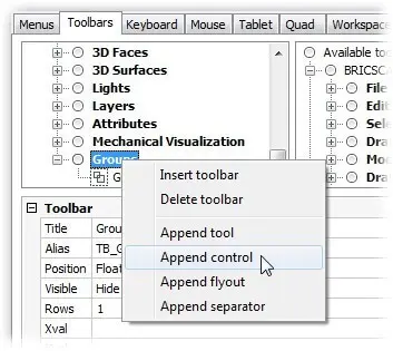
Choosing the Append tool from the shortcut menu
Notice the Add Controls dialog box. Choose the name of a control, such as "Color," and then click OK.
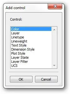
List of controls
Notice that the control is added to the toolbar's list.
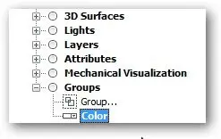
Control added to toolbar
Click Apply to see the control in the actual toolbar.
Customizing Controls (Droplists)
You cannot create new controls, but you can customize one aspect of them: their width.
![]()
Pair of parameters for controls
Here is what the parameters mean:
Control --- changes the control displayed by the toolbar. Click to choose another one from the drop list:
![]()
Changing the control
Width --- specifies the width of the control. Click to enter a new width, which is measured in pixels. The figure below shows how the width is measured on docked and floating toolbars. The width measurement includes the gray line at either end of the white area.
![]()
Setting the width of the control
ABOUT FLYOUTS
Flyouts are sub-toolbars that "fly out" from a toolbar button, as illustrated below.
![]()
The presence of a flyout is indicated by the small black triangle in the lower right corner of a toolbar button. Since flyouts are just toolbars within toolbars, you customize them kind of like a toolbar.
Tutorial: Adding Flyouts to Toolbars
To add flyouts, it's a bit tricky. Here are the steps involved:
Right-click an existing toolbar. For this tutorial, choose Group.
In the shortcut menu, choose Append Flyout.
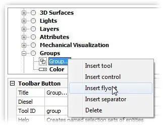
Inserting a flyout
Notice the Append Flyout dialog box. Give the flyout a name and then click OK. (For this tutorial, I use the name "Flyout Sample.")
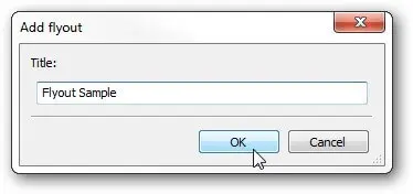
Naming the new flyout
Notice that the flyout appears twice: once as a sub-toolbar and again as a toolbar in its own right.
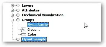
Double appearance of the flyout
You can now populate the flyout with tools in two place: the embedded Flyout Sample sub-toolbar or the vestigial Flyout Sample toolbar. The difference between them is as follows:
- Embedded sub-toolbar --- you must use the Append tool; you cannot use the Insert tool nor can you drag commands from the Commands pane
- Vestigial toolbar --- you can use the Insert tool and can drag commands from the Commands pane.
Any change you make to the vestigial toolbar appear in the embedded toolbar. I recommend using the vestigial toolbar, because you can simply drag'n drop. Drag tools from the Command pane onto the Flyout Sample toolbar.

Dragging and dropping commands into a toolbar
To add more commands to the flyout, repeat step 5. Notice that both toolbars contain the same list of commands.
Click OK to apply the changes and then view the changed toolbar.
The customized Groups toolbar now looks something like this:
![]()
Toolbar with a button, a flyout and a control
Because flyouts are simply toolbars, you can customize them just as you do toolbars. You cannot, unfortunately, simply drag existing toolbars on top of others to turn them into flyouts.
ABOUT SEPARATORS
Separators are those lines that separate groups of buttons, as shown below. These are handy for visually segregating related groups of buttons. There is nothing to customize about separators: either you add them to a toolbar or you do not.
Tutorial: Adding Separators to Toolbars
To add a separator to a toolbar, follow these steps:
Open a toolbar by clicking the + button. For this tutorial, choose Groups.
Select a tool name, such as the Color control. The separator bar is added in front of the selected tool.
Right-click and then choose Add separator.
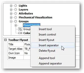
Choosing to add a separator
Notice a row of dashes ( ------ ) is added to the Groups node, indicating the position of the separator bar.
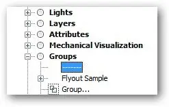
Separator indicated by row of dashes
If you don't like the position of the separator, drag it elsewhere.
On the toolbar itself, a vertical gray line appears. Click Apply to see the change to the toolbar.

Separator added to toolbar
That's about as easy as it gets!
REMOVING BUTTONS, RENAMING AND DELETING TOOLBARS
You can remove buttons, rename toolbars and delete them. To perform these actions, open up the Customize dialog box, go to the Toolbars tab and then choose the toolbar you want to edit.
Tutorial: Removing Buttons and Toolbars
To remove a button from a toolbar:
Right-click a button's name and then choose Delete.
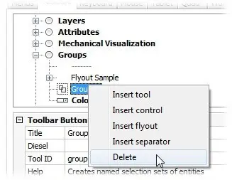
Deleting a toolbar button
When BricsCAD asks whether you are sure, choose Yes. (You can click don't show this again).
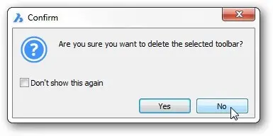
Answering Yes (or No)
Click Apply to see the toolbar with one fewer button.
The same procedure is used to delete toolbars: right-click a toolbar name and then choose Delete Toolbar.![]()
Tutorial: Renaming Toolbars and Buttons
You can change the names displayed by toolbars and buttons. To rename a toolbar, follow these steps:
Select a toolbar in the Customize dialog
In the Macro pane, choose the Title
Edit the name.
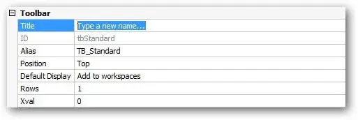
Renaming a toolbar
Click Apply to see the name change on the toolbar's title bar, if it is a floating toolbar.

Toolbar sporting its new name
You rename buttons in the same manner: select a button in the Customize dialog box and then edit its Title parameter.
![]()
Renaming a button
The name appears in the tooltip when you hover the cursor over the button.
Customizing Buttons
Buttons are customized in a manner similar to that of toolbars. The parameters that can be changed are described by the boxed text, above. To start customizing buttons, follow these steps:
Enter the Cui command to open the Customize dialog box and then select the Toolbars
Open any toolbar by clicking the + next to its name. For example, open Standard.
Selecting a button to customize
Select a command name, such as QNew. Notice the button parameters that appear at the bottom of the dialog box, such as Title and Diesel.

Parameters that can be modified on toolbar buttons
With the Customize dialog box ready to modify buttons, let's go on to see what can be done in regards to this.
MODIFYING BUTTON PARAMETERS
You can change the following button parameters:
- Title --- specifies the name displayed by the tooltip. The tooltip appears when you hover the cursor over the toolbar button.
- Help --- specifies the help text displayed on the status bar. The text appears in the status bar, again when you hover the cursor over the button.
- Command --- specifies macro executed by clicking the button. This macro can consist of a simple command name, like line or multiple command names within a lengthy series of instructions.
- Image --- specifies the picture (a.k.a icon) displayed by the button. You can use icons provided by Bricsys or use your own.
I recommend that you leave Diesel and Tool ID fields alone. Diesel, because its functions are carried out by the Command field; ToolID, because it's best not muck about with how BricsCAD identifies buttons internally.
SIZING BUTTONS
You can have three sizes of buttons on toolbars: regular, large and extra-large. Larger buttons are easier to see on very-high resolution monitors, but smaller ones let you see more toolbars at a time. The ToolbarIconSize variable affects all buttons on every toolbar uniformly; it has no impact on ribbon buttons.
 Regular: 16×16 pixels
 Large: 32×32 pixels
 Extra-large: 64×64 pixels
The easiest way to change the size is to right-click a UI element and then choose Toolbar Size.
![]()
To change the name displayed by the button's tooltip, follow these steps:
Tutorial: Editing the Title Name and the Help String
Click the field next to the Title parameter.

Editing the Title parameter
Edit or replace the text.
Click Apply to make the change stick.
Follow the same steps to change the help text displayed by the status bar: Click the Help field, edit the text and then click Apply.
![]()
Editing the help text
Tutorial: Changing the Command Macro
To change the macro that is executed when you pick the toolbar button, follow these steps:
Click the field next to the Command parameters.

Editing the command's macro
Enter a new macro. If all you want to is to execute a single command, then use this template:
^c^c_command.
Replace "command" with the command name of your choice. For example, to execute the PLine command, then enter ^c^c_pline. (For details on writing macros, see the chapter on "Writing Macros and Diesel Code.")Click Apply.
TIP After you change a parameter, it is shown in boldface to remind you that it has changed. The boldfacing goes away after you press Apply.Click the Apply button to see the effect of changes you've made to the button(s).
Although it is not explicit, you can copy and paste text in the parameter fields, as follows:
- To copy: select text and then press Ctrl+C.
- To paste: place cursor and then press Ctrl+V.
Ctrl+X also works to cut text, as does Ctrl+Z for undo, Ctrl+Y for redo, Ctrl+A to select all text and Del to delete.
Tutorial: Replacing Button Images
To change the picture displayed by the button, follow these steps:
- Pick the field next to the Image parameter.

Accessing the button editor
- Notice the ... button at the end of the field. Click it to access the Tool Image dialog box. This dialog box offers four ways to access collections of pictures (or icons)
Builtin --- lists images available within BricsCAD. Scroll through the list, choose an image and then click OK.
![]()
Choosing an icon from those provided by BricsCAD
Bitmap file --- selects an image on your computer:
Choose the size:
- One Image File --- standard size only (16×16 pixels)
- Small and Large Image Files --- both standard and large (24×24 pixels).
Click the ... button
From the Tool Image dialog box, Chose choose a file in BMP (bitmap), GIF, JPEG, or PNG format. The image is automatically resized to fit the area of the button.
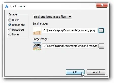
Choosing an icon from a file
Click Open and then repeat for the large image, if necessary.
Click OK.
Resource --- chooses an image from a resource file. These .dll or .exe files are used by Windows to run programs and often contain a small collection of icons. At time of writing this book, this option did not work and so all you can do is click Cancel.
None --- removes the image from the button. In this case, the button is blank.
![]()
Specifying no icon for the button
BricsCAD does not have a built-in icon editor. Instead, you can use a raster editor like PaintShop Pro to create images and then use the Bitmap File option to load them into BricsCAD.
Download BricsCAD free for 30-days
Start Using BricsCAD Today
Permanent or subscription licenses that work in all languages, in all regions.
- Introduction
- 55 Tips for BricsCAD Users
- Settings
- Changing the Environment
- Custom User Interface
- Introduction to the Customize Dialog Box
- Customize the Menu Bar & Context Menus
- Toolbars and Button Icons
- Writing Macros and Diesel Code
- Ribbon Tabs and Panels
- Keystroke Shortcuts, Aliases & Shell Commands
- Mouse, Double-click & Tablet Buttons
- Absolutely Everything You Need to Know About The Quad
- Rollover Properties
- Workspaces and the User Interface
- Designing Tool & Structure Panels
- Creating Simple & Complex Linetypes
- Patterning Hatches
- Decoding Shapes & Fonts
- Coding with Field Text
- Writing Scripts
- Programming with LISP (Introduction)
- LISP Functions
Explore BricsCAD
Download BricsCAD Free Trial | Sign Up For News & Updates | Shop Online For BricsCAD Desktop Software

