Write Macros for CAD software
In this post, you learn how to customize the tabs and panels of the ribbon in BricsCAD®.
The ribbon is a Microsoft-designed user interface that some love to hate, and others have come to like. Even though the ribbon is "unique" to Windows, Bricsys wrote a custom version so that the ribbon works identically with the Linux and macOS versions of BricsCAD.
The following topics are covered in this post:
- Understanding the structure of ribbons
- Defining the look of the ribbon through workspaces
- Creating new tabs
- Adding panels to tabs
- Designing new panels
QUICK SUMMARY OF RIBBON COMMANDS AND VARIABLE
COMMANDS
Ribbon displays the ribbon.
RibbonClose closes the ribbon.

SYSTEM VARIABLES
RibbonState (read-only) reports whether the ribbon palette is open or closed:
- 0 = ribbon is closed
- 1 = open (default in most workspaces)
RibbonDockedHeight determines the height of the ribbon when docked:
- 0 = ribbon sizes itself to the height of the selected tab
- 120 = default value
- 1 to 500 pixels = range
RibbonPanelMargin specifies the distance between buttons and the edges of the ribbon panel:
- 0 = no spacing; default value
- 50 = maximum value; in pixels
CleanScreenOptions determines whether the ribbon is displayed in clean screen mode:
- 8 = ribbon is not displayed
StartUp specifies whether the ribbon is displayed by the Start window:
- 3 = display Start page without ribbon
- 4 = display Start page with ribbon
SETTINGS DIALOG BOX
The Ribbon section of the Settings dialog box holds only two of the ribbon variables:
The Structure of Ribbons
Along the top of the ribbon is a series of tabs with names like Home and Insert. Tabs are collections of panels, and panels collect similar commands. You can think of tabs as overlapping toolbars. (new in v20) The B "tab" is not a tab, but the file menu; that's why it's colored blue.

The ribbon consists of tabs and panels
Panels are identified by names along the bottom of the ribbon, like Draw and Modify.
When the ribbon is too wide for the screen, panels are compacted with a slideout, as shown below.

Condensed Annotations panel showing all items in a slide-out panel
The purpose of subdividing a ribbon into tabs and panels is to present a logical collection of related commands. For example, many 2D drawing and editing commands are found in the Draw tab. All parametric commands are clustered in the Parametric tab.
The formal structure of a ribbon looks like the following:
Ribbon
Tab (one or more tabs)
Panel (one or more panels)
Rows (rows are optional; multiple rows allow vertically-stacked buttons)
Buttons and combo bars (drop lists)
Ribbon breaks (separator lines)
Split buttons (drop-downs, fly outs)
Toggle buttons (change color to show on-off status)
Here it gets tricky: although tabs and panels are customized by the Customize dialog box, the content of ribbon you see on the screen can also be defined by the current workspace! So, when you customize the ribbon, you may have to work in two places:
Ribbon tab --- defines all ribbon tabs and panels available to BricsCAD
Workspace tab --- toggles the visibility tabs and panels to determine which ones are seen by users
Technically, this is called "indirection." It makes customizing ribbons more complex with the benefit of greater flexibility. It makes things easier for you, the customizer: create one master set of tabs and panels, and then click them on and off for various workspaces.
TUTORIAL: HOW TO ADD PANELS TO RIBBON TABS
There are two ways to customize the ribbon: change the panels displayed by tabs, and change the content of panels. First, let's see how to add a panel to a ribbon tab.
Start BricsCAD
If there is no ribbon visible, then turn it on. To display the Ribbon, enter the Ribbon command:
:ribbon
Notice that the ribbon appears. If toolbars are on, then the Ribbon appears below them.

Ribbon added to the "Drafting (toolbars)" workspace
__TIP__ You turn off the Ribbon with the __RibbonClose__ command, or by clicking the small x at the Ribbon's upper left corner. When no drawings are open, all commands on the ribbon no longer work; they are colored gray. Use the __B__ "tab" to open a drawing or start a new one.
Open the Customize dialog I find typing the cui alias the fastest way to do this.
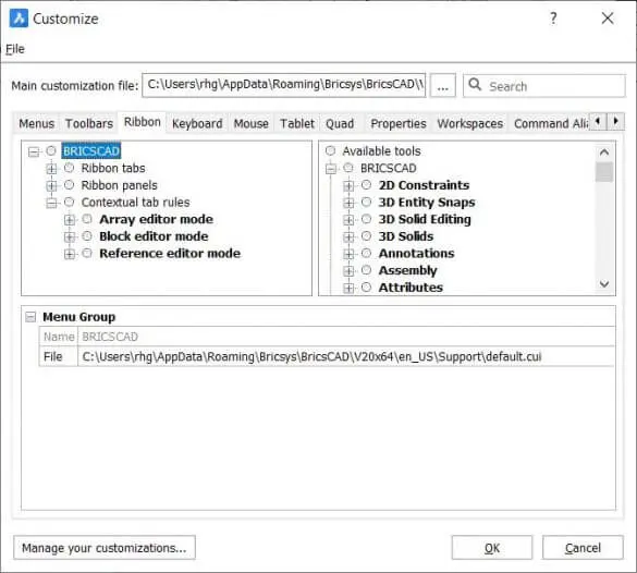
Choose the Ribbon (It can get confusing:* tabs* in the dialog box and tabs on the Ribbon. To distinguish between them, I'll always write "Ribbon tab" to refer to tabs in the Ribbon.) Notice there are three nodes for customizing Ribbons, Ribbon Tabs, Ribbon Panels and Contextual Tabs:
Ribbon Tabs node --- specifies which panels occupy a tab
Ribbon Panels node --- customizes the content of panels with buttons
(new to v20) Contextual Tabs node --- tabs that display for the duration of a command

Customize dialog box open to the Ribbon tab
Open the Ribbon Tabs node by clicking the Expand Notice the long list of tab names, starting with "Home." There are nearly 40 of 'em, and you can make more.
(new in V20) Tabs are listed in alphabetical order; some tabs have been renamed, such as "Home 2D" to "2D Home"; the total number of tabs is nearly doubled; contextual tabs are added.
Ribbon Tabs node showing tabs provided with BricsCAD
    __TIP__\
    Some tab names seem to have near-duplicate names, such as "2D Home" and "3D Home." The difference is that the 3D Home tab contains commands suitable for 2D drafting, while 3D Home is meant for 3D modeling.
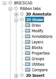
Each tab on the ribbon holds one or more panels. Click the Expand button next to 2D Home. Notice the list of panel names, such as Draw and Modify.

The panels that reside in the 2D Home tab
To add a panel to a tab, follow these steps:
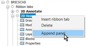
Right-click the name of a ribbon tab, such as 2D Home.
From the shortcut menu, choose Append Panel.

Right-clicking a tab to insert a panel
__TIP__ You might think that you could drag an item from the Available Tools pane, but it doesn't work with the tabs section. The Available Tools are meant for customizing panels.
Notice the Select Ribbon Panel dialog box. It lists the names all panels and not just ones related to 2D.

List of available panels to insert into tabs
3. Select the name of a panel, such as "2D Centerlines," and then click OK to close the dialog box. Notice that the panel is added to the end of the 2D Home list.

Centerlines panel added to the end of the "2D Home" tab
4. To see the newly added panel in the ribbon, click OK to close the Customize dialog box. Notice that the new panel appears at the far end of the ribbon's Home tab.

Centerlines panel added to the end of the Home tab
Moving Panels
You might want to change the order in which panels appear in a tab, simply drag them around.
In the figure below, I dragged the "Centerlines" panel up to Annotations. BricsCAD places it below (after) of the "Annotations" panel.

Rearranging the order by panels by dragging them around
The result of the move is shown in the ribbon illustrated below:

Centerlines panel moved next to Annotations
Copying Panels --- Not
Making a duplicate of a panel is a great way to make a new one, without starting from scratch. In previous releases, we could make a duplicate by holding down the Ctrl key (Cmd on Mac) while dragging. In V20, this appears to no longer work.
Removing Panels
To remove a panel, right-click its name, and then choose Remove from the shortcut menu.

Removing a panel from a ribbon tab
BricsCAD asks if you are sure; click Yes.

Confirming the removal
TUTORIAL: MAKING NEW TABS
You have seen how to modify the look of a tab by adding, moving, and removing panels. In this tutorial, you learn how to create a new tab from scratch.
Open the Customize dialog box and then goto the Ribbon.
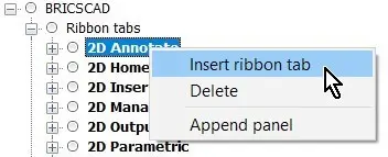
Open the Ribbon Tabs section, and then right-click any tab name. Notice the shortcut menu:

Appending a new tab
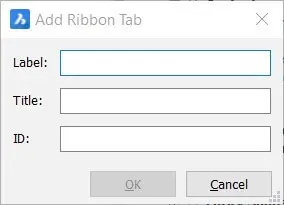
Choose Insert Ribbon Tab. Notice that BricsCAD opens the Add Ribbon Tab dialog box.

Naming the new tab
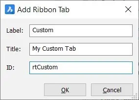
Fill out the fields with something unique, such as with this data:
- Label -- Custom (Label displayed by the tab on the ribbon)
- Title -- My Custom Tab (Title shown in the Customize dialog box)
- ID -- rtCustom (Identification used by BricsCAD to distinguish between elements -- "rt" is short for ribbon tab and identifies the purpose of the ID)

Dialog box filled out
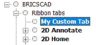
Click OK to close the dialog box. Notice that the new tab is added to the start of the list of tab names. You can drag it to another location, if you wish.

New tab added to the ribbon
At this point, the tab is empty. Exit the Customize dialog box, and notice that BricsCAD display its empty.
Empty tab
(new in V20) You now perform these adding and moving tasks in the Ribbon tab. Prior to BricsCAD V20, these tasks had to be done in the Workspaces tab, including making the new tab visible.
QUICK SUMMARY OF CONTEXTUAL TABS
(new to v20) Contextual tabs display automatically when a specific command is invoked, and then stay on the screen for the duration of a command. BricsCAD provides three of them, at the time of writing:
Array editor -- initiated by the ArrayEdit command
Block editor -- initiated by the
BEdit command Reference editor -- initiated by the
RefEdit command (see below)
When the command ends, the tab disappears. Contextual tabs appear to be hard-coded into BricsCAD and so you cannot create additional ones.
Adding Panels to A New Ribbon Tab
To add panels to the new, empty ribbon tab, review the earlier tutorial. In brief, right-click the tab's name, and then choose Append Panel.
Moving Tabs Along the Ribbon
To move a ribbon tab to a different location on the ribbon, just drag its name to the new spot in the Workspaces tab.
Making Copies of Tabs
When you hold down the Ctrl key (Cmd on Mac) while dragging the name of a ribbon tab, BricsCAD makes a copy of the tab.
Hiding Tabs in a Workspace
To hide a ribbon tab, you need to switch to the Workspace tab. Right-click its name in, and then choose Remove.

Hiding a tab by removing it from the workspace
Ignore the warning message: the Remove action does not erase the tab, but merely removes it from view in this specific workspace. To actually erase a ribbon tab from BricsCAD, you need to remove it in the Ribbon tab of this dialog box.

Ignore the warning message
CUSTOMIZING RIBBON PANELS
Now that you know how to customize and create ribbon tabs, let's move on to a more complex task: customizing the content of panels. It is at the panel level where the real work of customizing ribbons takes place!
BricsCAD boasts the many panels, and you can make your own. You can change the content of existing panels, add new panels, or erase them. Panels hold many kinds of elements, such as sub-panels, rows, buttons, and other controls.
QUICK SUMMARY OF PANEL PARAMETERS
When you select the name of a panel in the Ribbon Tabs section of the Customize dialog box, BricsCAD displays the following parameters:
This is the meaning of the parameters:
ID --- identification used by BricsCAD for this user interface element. It must be unique, and should not be changed for elements that ship with the software. In this case, "rp" is short for the Ribbon panel.
Collapse --- controls how to make panels smaller when the tab is wider than the BricsCAD window. Choose one of the options:
- Automatic lets BricsCAD decide when to collapse the panel; default setting for all panels
- Never Collapse keeps the panel full size, but cuts off buttons when BricsCAD window becomes too narrow
- Collapse Last causes other panels to collapse first
Label --- name that appears as the panel name on the ribbon. In this case, "File" appears:
Title --- title of the panel
Key Tip --- shortcut that accesses the panel from the keyboard (not yet implemented in BricsCAD)
Below I show the Layers ribbon panel alongside elements that make up the panel in the Customize dialog box.
TIP To easily see a panel's definition from its tab, right-click the panel name and then choose Show Panel. BricsCAD jumps to the panel's definition.
Notice that each panel definition begins with a Row element. It is followed by any other element, such as one or more buttons or more rows.
Panel Design Tips
Here are a couple of tips for designing panels:

Flyouts are defined by a Large button assigned Split behavior.

Three rows are defined by a sub-panel so that their elements are positioned adjacent to the large Layers flyout button
TUTORIAL: POPULATING A NEW PANEL
You learned in an earlier tutorial on how to create a new panel. Now it is time to fill it up (populate it) with buttons and other elements. Open the Customize dialog box, and click the Ribbons tab. You are working with the "Ribbon Panels" node, as follows:
- Right-click Ribbon Panels and choose Append Ribbon Panel.

Appending a panel
Recall that "Append" means the panel will be added to the end of the list.Notice the dialog box, and that it looks like the one for making new ribbon tabs: this one is specific to panels.

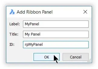
Naming and ID'ing the new panel
Fill in the fields as shown below, and then click OK.
- Label MyPanel (Identifies the panel inside the Customize dialog box
- Title My Panel (Labels the panel for the user on the ribbon
- ID rpMyPanel (Identifies the panel to BricsCAD; "rp" is short for ribbon panel
Notice that the new panel is added to the end of the list of panels. If you were to exit Customize now, you would see that it is blank, as illustrated below.

New panels are empty
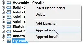
The very first thing you do with a new panel is to add a row. Rows hold buttons and other UI elements in a horizontal row. (To create a vertical column of elements, you would append two or more rows; BricsCAD stacks them automatically.) To add a row, follow these steps:
Right-click the name of the new
Choose Append Row from the shortcut

Adding a row to the new panel
Now fill the row with one or more buttons. First add a regular button, which BricsCAD calls a "command button." (Later you tackle the other buttons.) This is how it works:
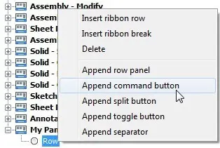
Right-click Row and then choose Append Command Button from the shortcut menu.

Adding a button to the row
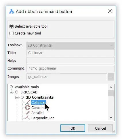
Notice the Add Ribbon Command Button dialog box. Ensure that Select Available Tool is selected.

Selecting a tool from the available ones
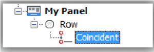
Choose a command, such as Coincident, and then click OK. Notice that it is added to the My Panel panel.

Tool (command button) added to the new row
(If you were to check the Ribbon back in BricsCAD, the panel would look like the figure below.)

Left: Panel with single command button; right: Editing the parameters that define the command button
In the parameters pane at the bottom of the Customize dialog box, there are fields that define the button. Several of them should be already familiar to you from the chapters on customizing toolbars and menus, such as Help, Command, and Image. See figure above, at right.
Of specific interest to ribbon design is the Button Style field. It provides the following options:

Styling the button
Here is what the options mean:
| Button Style | Icon Size | Text Lable | Illustration |
|---|---|---|---|
| Small With Text | 16×16 pixels | Beside the icon |  |
| Small Without Text | 16×16 pixels | No label |  |
| Large with Text (Vertical) | 32×32 pixels | Below the icon |  |
| Large with Text (Horizontal) | 32×32 pixels | Beside the icon |  |
| Large Without Text | 32×32 pixels | No label |  |
This is what the panel looks like with buttons made from each setting:

Same button displayed with different styles
With the basics of panel design accomplished, for the remainder of this chapter, I catalog all panel functions.
CATALOG OF PANEL ELEMENTS
Inserting and removing elements from panels is accomplished through shortcut menus, which are accessed by right-clicking existing elements. The sole exception is moving elements around, which is done through drag'n drop.
These are the three shortcut menus that contain the commands; the menu shown for "Row" is also the one accessed from all other elements, such as Panel and button.

Shortcut menus for editing panels
In the following sections, I describe the functions of each option grouped as follows:
- Append Ribbon Panel / Insert Ribbon Panel
- Delete
- Add Launcher
- Append Row / Insert Ribbon Row / Insert Row Panel
- Append Break / Insert Ribbon Break / Append Separator
- Append Split Button
- Append Toggle Button
Append Ribbon Panel / Insert Ribbon Panel
The Append and Insert Ribbon Panel options both add a new, blank panel to the list of Ribbon Panels. The difference between them is subtle:
- Append Ribbon Panel adds the new panel to the top of the list
- Insert Ribbon Panel adds the new panel to the end of the list
If it ends up in the wrong place, just drag the panel name to the proper location. Both options prompt you to fill out the fields in the same dialog box:

Labeling a panel
The ID should start with "rp" to identify it as a ribbon panel, and the name must contain no spaces.
PANEL PROPERTIES
Should you need to, you can modify the names in the properties pane, except for the ID, which is fixed permanently --- unless you erase the panel. (The Key Tip property does not function, yet.)

Properties of a panel
Delete
The Delete option erases the selected element. BricsCAD asks if you are sure:

Last chance before erasing it
Add Launcher
A launcher is a small panel with a flyout button. When you click the flout button, the panel expands, as shown below. This is useful for tabs that are really wide (keeping their size in check) or for panels that contain rarely used commands.

Left: Closed launcher; Right: opened launcher
TYPE PROPERTY
Launchers have just one unique property. Type toggles it between "Macro" and "Ribbon."

Type options
At the time of writing, however, they have no effect on the launcher.
Append Row / Insert Ribbon Row / Insert Row Panel
Rows and row panels are meant to group elements within panels. The difference between the three options are as follows:
- Append Row --- adds a row to the panel; a row holds one or more buttons horizontally
- Insert Ribbon Row --- also adds a row to the panel; there seems to be no difference from Append Row option
- Insert Row Panel --- adds a sub-panel to the panel; a panel holds one or more rows vertically
A common use of rows and row panels is to locate a group of smaller buttons adjacent to a large one, as illustrated below.

Left: Matrix of zoom buttons in panel; right: how they are defined in the Customize dialog box
To get the nine buttons adjacent to the one big Zoom Extents button, one Panel and three Row elements were used:
- (Row) Panel --- segregates the three rows from the big button
- Row (x3) --- creates three rows of horizontal buttons, stacked vertically
Rows have no properties; row panels have the following properties, none of which work at this time.

Properties of rows
ROW PANEL PROPERTIES
The Resize Style property determines what happens to the row panel when the ribbon is too small for the width of the BricsCAD window. However, none of these have an effect at the time of writing.
| Row Panel | Options | Meaning |
|---|---|---|
| Resize Style | Automatic | Lets BricsCAD handle the re-sizing on its own terms |
| Never hide text | Eliminates icons before eliminating icons | |
| Never wrap | Prevents panel from wrapping, splitting into two or more rows | |
| Never shrink | Prevents panel from being made smaller | |
| Do not resize | Prevents panel from changing its size | |
| Resize Priority | 100 (default) | Determines whether other panels should resize before this one. The range is 1 (resizes first) to 1000 (resizes last) |
| Justify Top | Yes | Justifies row panels to the top of the row |
| No | Centers the row panels |
TIP BricsCAD normally stacks ribbon elements vertically, and the Row Panel element aligns them horizontally. (There is no "column" element.) You can use row panels to create rows within rows or as columns (a stack of buttons) next to rows.
Append Break / Insert Ribbon Break / Append Separator
Breaks split a panel into two so that the second half slides out when clicked. BricsCAD, however, does not support breaks. If you were to append a break, the contents of the panel would disappear, so avoid using this element until Bricsys implements it!
The figures below show before and after appending a break to the Home-File 2D panel.

Left: Before....; right: ...and after applying the faulty Break parameter
Separators draw lines between elements in panels. BricsCAD, however, does not support breaks at the time of writing.
Append Split Button
To create a flyout-like effect on the ribbon, you take two steps: (a) append a split button, and then (b) specify how it works with the Behavior property. To add a flyout to the panel, follow these steps:
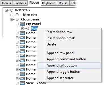
In the panel you are designing, right-click a row and then choose Append Split Button from the shortcut menu. For this tutorial, the panel is named "My Panel," as illustrated below.

Adding a slit button to a panel
Notice that Split Button is added to the row:

New split button
Assign a command by right-clicking Split Button and then choosing Append Command Button from the shortcut menu. From the Add Ribbon Command Button dialog box, select any command and then click OK. The result is a small button with the flyout icon to the right of the double circle icon --- the small black arrow. If you were to click it, you would see the button repeated on the flout.

Single split button
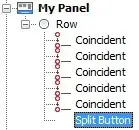
Add one or two more buttons to the split so that it looks something like this:

More buttons added to the split
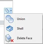
On the ribbon, the effect is as follows:

Multiple split buttons
With the split button in place, it's now time to adjust its look. Split buttons have several unique parameters of interest to you:

Parameters for split buttons
- Behavior --- determines what happens with the topmost button
- List Style --- specifies the look of buttons in the dropdown
- Grouping --- gathers buttons into groups
Let's take a look at how they affect split buttons.
BEHAVIOR PROPERTY
The Behavior property of split buttons determines how the topmost button behaves when users click on it. Here are the options:

Parameters for Behavior property
The options determine whether the button displays the default command (the first one in the list of buttons), or the most recently used one (abbreviated as "MRU" by the programming biz). As well, Behavior determines whether the element looks like a drop-down (like a flyout) or like a split button (shows two buttons at once).
TIPS Split buttons let you click the upper half to execute the most-recently-used command, or lower half to display the drop-list (flyout).
It is usual to use make split buttons large ones so that they are easier for users to manipulate.
At the time of writing, the Behavior parameter was not implemented; the only behavior that works is "Drop Down with Recent," no matter which one you choose.
LIST STYLE PROPERTY
The List Style property determines the look of buttons in drop-downs.

Left: parameters for List Style property; right: how they appear in the ribbon
At the time of writing, the List Style parameter was not implemented; the only style that works is "Icons with Text" no matter which one you choose.
GROUPING PROPERTY
Grouping property gathers buttons in split lists into groups. Grouping works with the Group Name property, which defines the groups by name, but it was not implemented in BricsCAD at the time of writing.
Append Toggle Button
Toggle buttons display a blue background when on, and a normal background when off. They are meant to provide a visual indication of the on-off status of a setting, as shown below with the Entity Snaps panel.

Toggle buttons appearing blue when turned on
The catch is that the Toggle button itself doesn't know how to handle the on-off status. It turns out that a toggle-style button adds a parameter for entering Diesel code, as highlighted below.

Diesel code needed to toggle buttons
DIESEL PROPERTY
BricsCAD monitors the Diesel code to see whether to turn the blue background on. This is exactly the same situation as with menu macros, in which you use Diesel to turn check marks on and off. Here is the code for one of the entity snap toggles on the ribbon:
$(if,$(=,$(and,$(getvar,OSMODE),0x0001),0),,!.)
The good news is that you can copy and paste this code; all you need to do is replaced "OsMode" with the name of another variable.
Download BricsCAD free for 30-days
Start Using BricsCAD Today
Permanent or subscription licenses that work in all languages, in all regions.
- Introduction
- 55 Tips for BricsCAD Users
- Settings
- Changing the Environment
- Custom User Interface
- Introduction to the Customize Dialog Box
- Customize the Menu Bar & Context Menus
- Toolbars and Button Icons
- Writing Macros and Diesel Code
- Ribbon Tabs and Panels
- Keystroke Shortcuts, Aliases & Shell Commands
- Mouse, Double-click & Tablet Buttons
- Absolutely Everything You Need to Know About The Quad
- Rollover Properties
- Workspaces and the User Interface
- Designing Tool & Structure Panels
- Creating Simple & Complex Linetypes
- Patterning Hatches
- Decoding Shapes & Fonts
- Coding with Field Text
- Writing Scripts
- Programming with LISP (Introduction)
- LISP Functions

