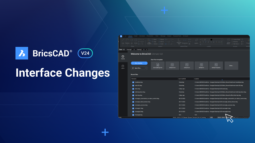
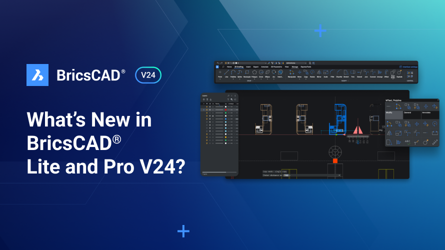
For V24, we've given BricsCAD® a facelift, you can look forward to a new Ribbon, a revamped Start Page, simplified Toolbars, and an improved Quad. We improved the consistency of BricsCAD, reduced the clutter, and ensured that the tools you need are where you need them when you need them.
Start Page
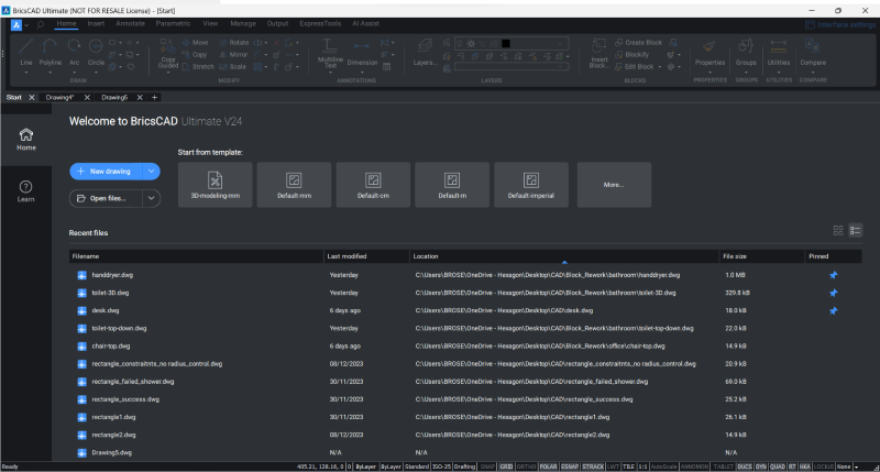
We have revamped the Start Page in BricsCAD V24! It now includes a table and grid view for your most recent drawings and the option to pin recently used drawings so they remain at the top of the list.
The Ribbon

The V24 Ribbon is built on new technology and includes a search bar and a modernized look.
We have simplified the tabs with larger icons and less clutter, making finding the most commonly used commands easier. Less frequently accessed tools have been moved to a single-click drop-down tab, with more space and a clearer overview of all additional tools.
The layout is now more consistent across all workspaces, allowing you to switch between workspaces without getting lost.
The Quad
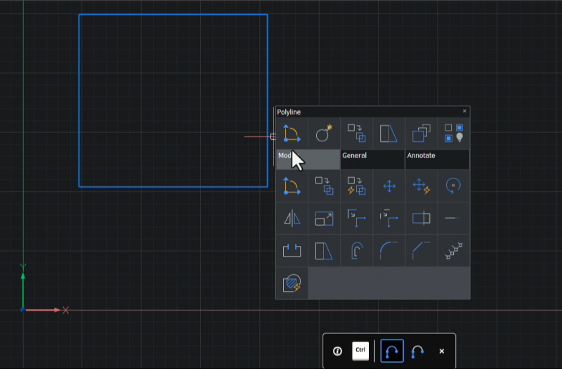
The Quad has been heavily reworked. The location of tools is now consistent across workspaces and more closely matches the Ribbon, Toolbars, and Menu bar. In addition, we removed tools that were infrequently used and reduced the number of tabs.
Toolbars

The Access Toolbar (located at the top-left of BricsCAD) has also been simplified. Commands that were readily available in other locations or not commonly accessed have been removed from this toolbar.
Why did we change the interface?
We conducted 100s of user tests and user interviews, crawled through 1000s of support requests and looked at data from the 1000s of users that have joined our data usage program.
In doing this, we learned that even advanced users with years of experience struggled to remember where tools were and spent time “hunting around” due to inconsistency across workspaces and areas of the product. While it might feel slightly different initially, we’re confident you’ll quickly learn where all your favorite tools are located.
Want to customize or configure BricsCAD?
We know change isn’t for everyone, so we’ve made it easy to configure BricsCAD so it works for you.
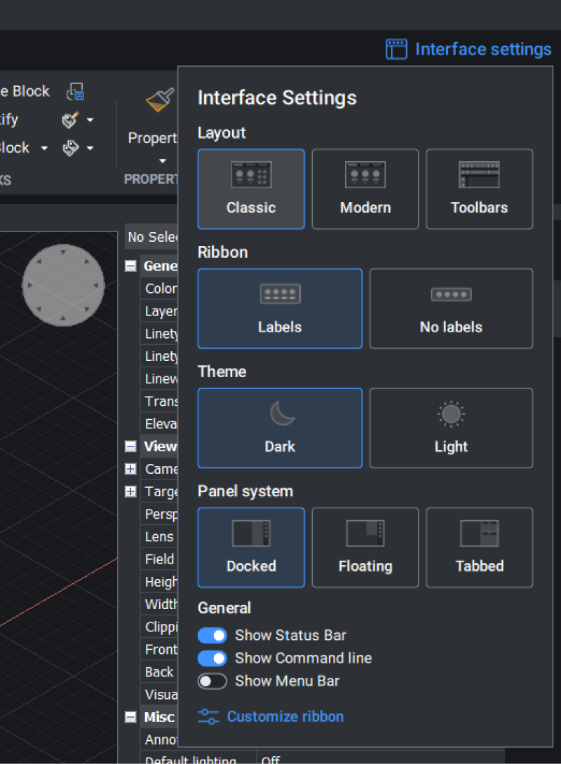
It is still possible to return to the classic Ribbon by selecting the “Classic” layout from the Interface Settings dialog, located in the top-right of the Ribbon. You can also revert to the classic Access Toolbars. Right-click anywhere on the Ribbon and select Access (Legacy) or Access3D (legacy) from the drop-down.
Additionally, customize your entire interface with the CUSTOMIZE command.
Do you have feedback?
Bricsys prides itself on being user-first when it comes to design. If you have any thoughts you’d like to share regarding changes to the user interface, good or bad, please get in touch! We want BricsCAD to help you get your work done most easily and more enjoyably, and the only way we can do that is with your help.
Consistency, Simplification, and Findability
That’s what you expect from your drawings! So, use the software to match and start working with BricsCAD now.
